

Explore your data in a 3D Maps tour
A Microsoft 3D Maps tour can show a time-based relationship between geographic locations and their associated data—such as population numbers, temperature highs or lows, or flight arrival delays.
When you start 3D Maps from a workbook that doesn’t already contain a tour, a new tour with a single scene is automatically created. Tours and scenes are the basic way to save the 3D Maps visualizations of your data.
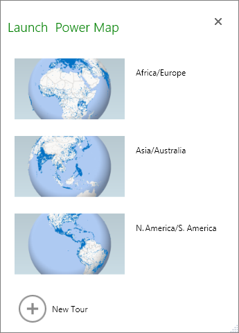
You can create as many tours as you want in a workbook. You switch between tours and create new tours by using the Launch 3D Maps box. This example has three tours that show world population by continent.
Create a tour
Select any cell in the Excel table or range of cells that has your data. Be sure to do this before you create the tour; it makes it easier for you to hook up the data to the new tour.
Click Insert > 3D Map > Open 3D Maps .
The Launch 3D Maps window appears, showing your new tour.
Add another tour to your workbook
The Launch 3D Maps box appears.
Click New Tour .
The new tour appears in the Launch 3D Maps window. If another tour was already open, 3D Maps closes it.
Save your tours
There’s no Save button in 3D Maps; all tours and scenes are preserved in the state in which you close the window. When you save your workbook, any 3D Maps tours and scenes are saved with it.
All changes you make to a scene in 3D Maps while editing are saved automatically, but any changes you make to a scene in tour playback mode—such as resizing, removing a legend, or removing a timeline—aren’t saved. All tours open in edit mode by default, and all the scenes in a tour are shown in the Tour Editor pane.
Add a scene to a tour
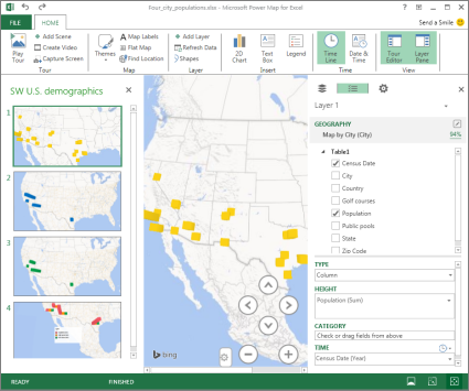
A tour can have a single scene, or multiple scenes that play sequentially to show different views of your data, such as highlighting a section of a map, or showing other data related to the geographic locations. For example, the first scene in your tour could show population growth for cities over time, followed by a scene showing the number of public swimming pools in those cities over the same time period, followed by more scenes that show other information about those cities. This example shows a four-scene tour for a selection of cities in the U.S. Southwest region.
Play a tour
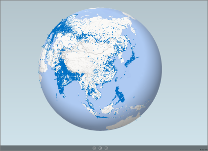
3D Maps always plays a tour in full-screen mode. Playback buttons are available at the bottom of the screen.
Open the tour from the Launch 3D Maps box.
In the 3D Maps window, on the Home tab, click Play Tour .
You can pause, play, move to the previous or next scene, or go back to edit mode. When you pause the tour, you can explore the 3-D environment and interact with it. Any changes you make in play mode aren't saved as part of the scene. Once you resume playback or go back to edit mode, the changes you made in play mode are lost.
Note: The Play Tour button always plays the tour beginning with the first scene. You can navigate to the scene you want with the Next and Previous buttons in Play mode.
Delete a tour
Note: The Undo command in Excel can't restore a tour you've just deleted.
In the workbook, click Insert > 3D Map > Open 3D Maps .
Right-click the tour, and click Delete .
Copy a tour
In the Launch 3D Maps box, right-click a tour and click Duplicate . This creates a new tour that you can fine tune, while leaving the original tour untouched.
Learn more about working with 3D Maps
Change the look of your 3D Maps
Add a heat map in 3D Maps

Need more help?
Want more options.
Explore subscription benefits, browse training courses, learn how to secure your device, and more.

Microsoft 365 subscription benefits

Microsoft 365 training

Microsoft security

Accessibility center
Communities help you ask and answer questions, give feedback, and hear from experts with rich knowledge.

Ask the Microsoft Community

Microsoft Tech Community

Windows Insiders
Microsoft 365 Insiders
Was this information helpful?
Thank you for your feedback.
Simon Sez IT
Online software training and video tutorials for Microsoft, Adobe & more
- Get Started
- Access 2021 Beginners
- Access 2021 Advanced
- Access 2019
- Access 2019 Advanced
- Access 2016
- Copilot in Microsoft 365 for Beginners
- Copilot Essentials in Microsoft Office
- Microsoft Excel 365 Essentials
- Microsoft Excel 365 Advanced
- Microsoft Excel 365 Intermediate
- Excel 365 for Beginners
- The Accountants Excel Toolkit
- Microsoft 365
- OneNote Desktop and Windows 10
- OneNote 2016
- Outlook 2021
- Outlook 2019
- Outlook 2016
- Outlook 2013
- Outlook 2010
- Introduction to Power Automate
- Power BI Essentials
- Power BI Training
- Power BI Intermediate
- PowerPoint 365 for Beginners
- PowerPoint 2021
- PowerPoint 2019
- PowerPoint 2016
- PowerPoint 2013
- Project 2021 Advanced
- Project 2021 Beginners
- Project for the Web
- Project 2019
- Project 2019 Advanced
- Microsoft Publisher 365
- Publisher 2013
- SharePoint Online: The Essential Guide (2023)
- SharePoint Online (2021)
- SharePoint Foundation 2013
- SharePoint Server 2013
- SharePoint Foundation 2010
- Microsoft Teams (2023 Update)
- Macros and VBA for Beginners
- VBA for Excel
- VBA Intermediate Training
- Microsoft Visio 2019
- Microsoft Visio 2010
- Windows 11 Advanced
- Windows 11 (2023 Update)
- Windows 10 (2020 Update)
- Microsoft Word 365
- Word 2019 Advanced
- Dreamweaver CC
- Dreamweaver CS6
- Dreamweaver CS5
- Dreamweaver CS4
- Adobe Illustrator CC for Beginners
- Adobe InDesign CC for Beginners
- InDesign CS6
- InDesign CS5
- Adobe Photoshop CC Advanced
- Adobe Photoshop CC Intermediate
- Adobe Photoshop CC for Beginners
- Photoshop CS6
- Photoshop CS5
- Photoshop Elements 2022
- Photoshop Elements 2019
- Photoshop Elements 2018
- Photoshop Elements 15
- Photoshop Elements 14
- QuickBooks Online 2024
- QuickBooks Desktop 2024
- QuickBooks Desktop 2023
- QuickBooks Desktop Pro 2022
- QuickBooks Pro 2021
- AngularJS Crash Course
- Bootstrap Framework
- HTML/CSS Crash Course
- HTML5 Essentials
- Java for Beginners
- JavaScript for Beginners
- jQuery Crash Course
- MySQL for Beginners
- PHP for Beginners
- Advanced PHP Programming
- Matplotlib, Seaborn, and Plotly Python Libraries for Beginners
- Python Object-Oriented Programming
- Pandas for Beginners
- Introduction to Python
- SQL for Beginners
- SQL Server Integration Services for Beginners
- XML Crash Course
- Alteryx Advanced
- Introduction to Alteryx
- Introduction to Data Visualization and Business Intelligence Principles
- Analytical Methods for Effective Data Analysis
- Introduction to Analytics and Artificial Intelligence
- Data Analytics in Excel
- Financial Risk Management
- Financial Forecasting and Modeling
- Qlik Sense Advanced
- R Programming
- Tableau Desktop Advanced
- Tableau Desktop
- Advanced Agile Scrum
- Agile Scrum Training
- Using ChatGPT to Increase Accounting Productivity
- AI In Action: Transforming Financial Operations
- Using Generative AI for Images and Videos
- Generative AI and Cybersecurity
- Introduction to ChatGPT
- Introduction to Asana for Project Management
- Asana for Employees and Managers
- Introduction to Asana
- Effective Communication Tactics for the Modern Workplace
- Introduction to Confluence
- Introduction to Pipedrive
- HubSpot CRM for Beginners
- Google Slides for Beginners
- Introduction to Google Chrome
- Introduction to Google Calendar
- Introduction to Google Drive
- Gmail for Beginners and Pros
- Getting Started in Jira
- Getting Started in Monday.com
- Cybersecurity Essentials: Stay Safe and Secure Online
- Cybersecurity Awareness Essentials
- Introduction to Wrike for Project Management
- Excel Efficiency and Data Management
- Excel Advanced Features and Customization
- Mastering PivotTables
- Microsoft Suite Productivity

5 Steps to Easily Use Excel 3D Maps (Bonus Video Included)
This 3D Maps in Excel tutorial is s uitable for users of Excel 2016/2019 and Microsoft 365.
Objective
Create an Excel 3D Map to visualize various variables of data across different Geographies. This guide covers:
- Excel 3D Maps Explained
- Video Tutorial
- How to Make Excel 3D Maps?
Excel 3D Maps – Closing Thoughts
Excel 3d maps explained .
Note: 3D Maps in Excel is a data visualization tool available in Excel 2016 and 2019. Excel 2013 users can also use 3D Maps, but it is available as an add-in called Power Maps. If you are using Excel 2013, you will need to jump into Options > Add-Ins and enable Power Maps .
Imagine this, you want to impress your boss in your next presentation and graphically represent your data across different regions in a visually appealing way. You either thought that this is impossible to implement on Excel or advanced external tools are needed.
Until Now.
Not only are 3D Maps in Excel possible, they can be painlessly created in minutes if you follow this guide. So without further ado, let’s begin.
Three-dimensional Maps helps you visualize data in a different way and discover insights you might not see in traditional two-dimensional tables and charts.
Related:
Basic Forecasting In Excel: Recorded Webinar
Advanced Pivottables – 1 Hour Crash Course
Dashboards In Excel Using Pivot Tables, Pivot Charts And Slicers
Excel 3D Maps can analyze geographical data. For example, if you are trying to analyze and compare the population of countries around the world. Or maybe analyze crime stats for different towns or states.
With Excel 3D maps you can plot geographic and temporal data on a globe or custom map. You can show the data changing over time, build engaging, cinematic visual tours and importantly, any map you create can be shared with other people.
NOTE : Excel 3D Maps use Microsoft Bing Maps to compile the map, so you will need to make sure you have an active internet connection.
Video Tutorial
How to Make Excel 3D Maps?
If you were left scratching your head by the internet about creating Excel 3D maps, do not fret. We, at Simonsezit, have compiled a set of 7 easy steps to go about creating these complex-looking 3D maps in Excel.
- Creating a 3D Map
- Customizing the 3D Map
- Navigating the 3D Map
- Creating a Tour
- Playing & Sharing a tour.
Read on to implement these Excel 3D maps in your next presentation easily, and to keep your coworkers enthralled.
In this example, I am using sample data available from Microsoft that shows Power Stations in each state of the US and the type of energy they provide.
If you would like to use the same data, you can download it here . Scroll to the bottom of the page for links.
Create a 3D Map
Your data must contain geographical information to create Excel 3D maps. For example, rows or columns that have names of cities, towns, postcodes/zip codes, states, countries, regions, etc.
- Open the workbook that contains the data you want to analyze
My data is in a table, but you do not need to format the data as a table for 3D Maps in Excel to work. Note that my data contains geographical information, ‘ State’ in column A, and ‘ County’ in column B.
- Click in any cell in the data
- Click the Insert tab
- From the Tours group, click 3D Map
The Launch 3D Maps box will display some recommended tours. These act as a template from which to start and are just suggestions by Excel based on your data. This functionality is similar in many ways to Recommended PivotTables and Pivot Charts . In this example, I am going to create a new tour from scratch.
- Click New Tour
3D Maps uses Bing to geocode your data based on the geographical information contained in your dataset. My data relates to Power Stations across the US, and so I have a globe representing that data.
Also Read:
Creating An Excel Dashboard In 5 Minutes
Excel Templates For More Efficient Project Management
Creating A Dynamic Pivot Chart Title Using Slicers
Much like a PivotTable , I have a floating panel titled Field List . This panel contains all the column headings from my dataset.
On the right-hand side, I have a Layer Pane . This pane is where I can add fields to visualize and analyze my data in different ways. Verify that the fields are mapped correctly in the Location area, i.e., ‘County’ is mapped to ‘County,’ ‘State’ is mapped to ‘State.’
Currently, my map is showing a blue dot in every location where there is a Power Station.
I can refine this by adding fields from the Field List to the Height, Category and Time areas in the Layer Pane.
- Drag the Capacity (Megawatts) field from the Field List and drop it in the Height area of the Layer Pane
Excel will re-adjust the visualization and add a legend. If you do not want the legend at this stage, you can select it and press the Delete key.
- Drag the State field from the Field List and drop it on the Category area in the Layer Pane.
Each state is now represented in a different colour.
Customizing Excel 3D Maps
There are many tools and utilities available in Excel to customize your 3D Maps.
Turning the Legend off and on
I might decide at this stage that I want to turn the Legend back on. The Home ribbon contains all the commands available for making changes to your Excel 3D Maps.
- From the Insert group, click Legend
The legend can be resized by dragging the resize handles in or out.
Currently, the legend is named ‘Layer 1’ . You will probably want to rename this to make it more meaningful. To rename the layer, click the Edit button next to the layer name in the Layer Pane and type a new name.
Navigating the Excel 3D Map
Find Location
You can zoom in on a location of interest using the Find Location button. Simply type in the place name and click Find . Remember, the place name must exist in the dataset.
Moving around the 3D Map
Click and drag with your mouse to move the map around. You can utilize the zoom buttons to zoom or out on a location. In this example, I am interested in looking a little closer at the Power Stations located in California.
Creating a Tour
You can utilize Excel 3D Maps to create an engaging Tour. A tour is like a video in many ways. Each tour contains scenes, and each scene can display a different view or aspect of the map. Excel 3D Maps will transition smoothly between the scenes making an interactive and engaging tour. These transitions help illustrate the story of your data.
In this example, my first scene in my tour shows an overview of all Power Stations in each state. My second scene zooms in on California. My third scene zooms in on Colorado. My fourth scene zooms out to show all states and switches to a ‘ Flat Map’ view.
To make changes to a scene, select the scene and click the Scene Options button.
You can change the look and feel of a scene by selecting the Themes option.
You can add Text Boxes to a scene to label maps or provide additional information by clicking the Text Box option.
Playing and Sharing a Tour
Once you have finished editing your tour, you can choose to play it, or you can share it with others.
- To Play, select Play Tour
- To Share, select Create Video
Latest Posts
- How to Print Envelopes in Microsoft Word: Microsoft Word Tutorial
- Data Models, PivotTables, and Power Query in Excel – Recorded Webinar
- Adding and Formatting Speaker Notes to a Presentation in Microsoft PowerPoint
- Conditional Formatting in Excel – Recorded Webinar
- Importing Data from Excel to Access
Does Excel 2013 have 3D maps?
Yes, Excel 2013 has a 3D maps feature. But, it is available as an add-in called Power maps. To activate it go to options—>add-ins—->enable Power maps.
How to use 3D maps in Excel?
Excel 3D Maps are generally used to track data variables like performance or sales across different geographic regions. Follow the steps above to use them easily.
Can we add custom regions in Excel 3D maps?
Yes, we can add custom regions in Excel 3D maps by importing the data set of this custom region in the “kml” or “shp” file format from sources like Google maps.
We are near the end of this short guide on Excel 3D Maps. We showed you how to create 3D Maps in Excel, create a tour in 3D maps and navigate locations inside it. To drive home the point, Excel 3D maps are mainly used to visualize various data variables across geographical locations.
Whilst this is enough to get you started with Excel 3D Maps, there are so many options and different ways to customize and analyze your data using maps in Excel. You can find out more information by checking out the following links:
Wall Street Mojo – 3D Maps in Excel
Excel Esquire – Amazing 3D Map Charts in Excel 2016
For more Free Excel tutorials from Simon Sez IT. Take a look at our Excel Resource Center .
Other Excel classes you might like:
- Protecting WorkBooks in Excel
- Logical Functions in Excel
- Designing Better Spreadsheets in Excel
- Introduction to Power Pivot & Power Query in Excel
To learn Excel with Simon Sez IT. Take a look at the Excel courses we have available.
Deborah Ashby
Deborah Ashby is a TAP Accredited IT Trainer, specializing in the design, delivery, and facilitation of Microsoft courses both online and in the classroom.She has over 11 years of IT Training Experience and 24 years in the IT Industry. To date, she's trained over 10,000 people in the UK and overseas at companies such as HMRC, the Metropolitan Police, Parliament, SKY, Microsoft, Kew Gardens, Norton Rose Fulbright LLP.She's a qualified MOS Master for 2010, 2013, and 2016 editions of Microsoft Office and is COLF and TAP Accredited and a member of The British Learning Institute.
Similar Posts
How to Use Timed Slides for Your PowerPoint 2013 Presentation
Using Web Hyperlinks in Visio 2010
How to Fix the #Div/0 Error in Excel? 2 Easy Methods
5 Best JIRA Alternatives
How to Fix the #VALUE! Error in Excel? 3 Different Scenarios
Picture Options in PowerPoint 2016
- Privacy Policy

ADVANCE YOUR CAREER
Gain instant access to 200+ courses. Earn a CERTIFICATE each time you complete a course.
Creating Stunning 3D Maps in Excel- The Complete Beginner’s Guide

This tutorial is a detailed guide to creating stunning 3D maps in Microsoft Excel. With 3D maps, you can make your geographical data reports more attractive and informative, thanks to Excel’s smarter updates.
By the end of this tutorial, you would have learned to create and customize 3D maps based on real databases from scratch.
Let’s get cracking!
Steps to create 3D maps in Excel
Let’s get started with creating and customizing 3D maps in Excel.
The first step is to create tabular geographical data to create a 3D map for it.
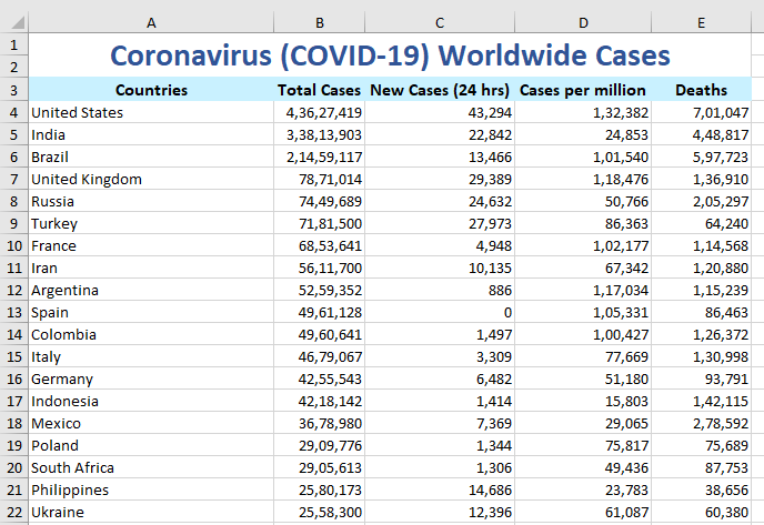
Here is a sample dataset of the all-time and 24-hour worldwide COVID-19 cases.
Getting started: Enabling or adding the Power Map add-in
Let’s quickly create a 3D map of this dataset.
Before you begin, you need to enable a COM add-in to let to apply 3D maps to data. You can easily insert the add-in if you use Excel 2016 or a higher version of Excel.
If you’re on Excel 2013, then download and install the Power Map Add-in for your Excel version from the web.
Here’s how you can enable the Power Map add-in in Excel if you’re on a higher version, or have already installed the add-in.
- Go to the File tab.
- Click on Options .
- Click on Add-ins on the left.
- Choose COM add-ins from the Manage at the bottom.
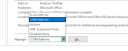
- Enable Microsoft Power Map for Excel .
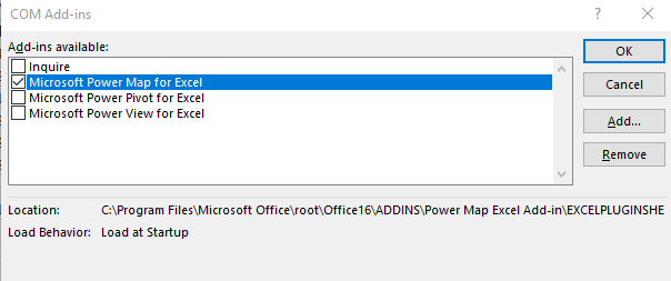
You’re all good to go now!
Inserting the 3D map
Make sure you are connected to the internet because Excel uses Bing Maps to create 3D maps.
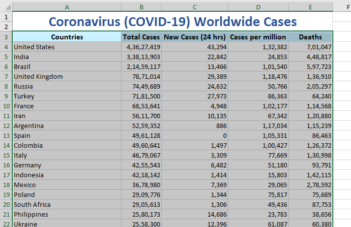
- Select the entire database with the headers.
- Go to the Insert tab.
- Click on 3D Map .
- A new window opens showing the locations on a map.
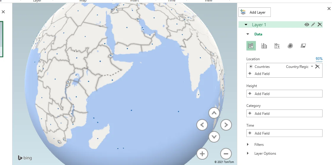
Handling data on the 3D map
The windowpane on the far right shows some options to display the desired fields on the map.
You can add a field from your table to the different layers available.
- Change the visualization to region.
- For instance, we add the New Cases field in the Value layer.
- The map is now highlighting the countries that had new coronavirus cases within 24 hours.
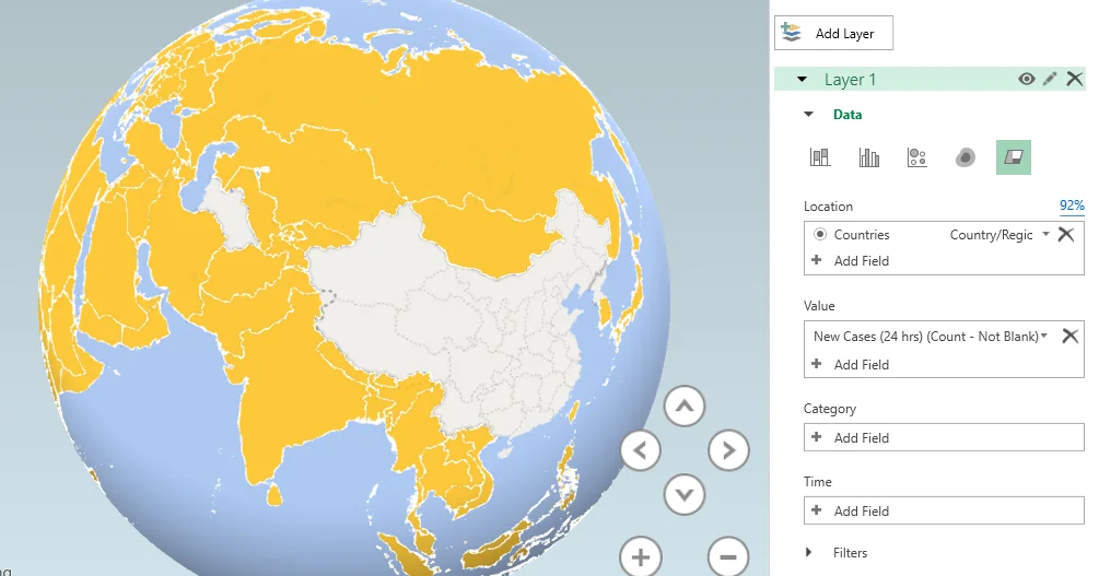
You can choose different data visualization options like Heat Map, Region, Bubble, Clustered Column, and Stacked Column.
- Click on the Flat Map button on the ribbon above to get a flat view of the map.
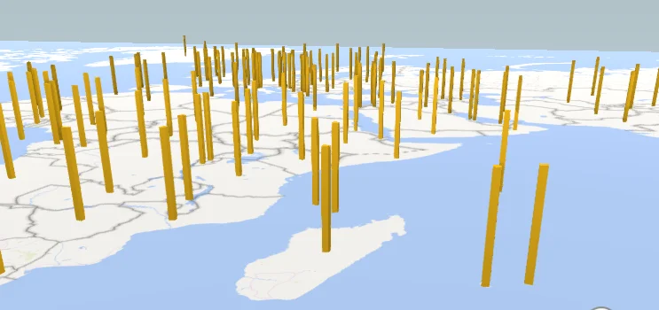
- Click on Find Location on the top ribbon to find a custom location on the map.
- Type the name of a location.
- For example, “ Muscat ”.
- Click Find .
- Click on Map Labels to view area names on the map.

If you have made any changes to the source data table in Excel, you can click Refresh Data on the top ribbon to update that information on your map.
Customizing the 3D map
To change the look of your 3D map.
- Click on the Themes button on the ribbon.
- Choose a theme for your map from the available options.
To hide or unhide the legends on the chart.
- Click on Legends in the top ribbon to view or unhide the legends on the map.
- Click on the legends box on the map and press Delete on your keyboard to hide the legend.
To insert a text box on the map.
- Click on the Text box button on the ribbon.
- Add a custom title to the text.
- Add a custom description.
- Apply the text customization options like color, font size, font style, text box fill color, and font family.
- Click Create when you’re done.
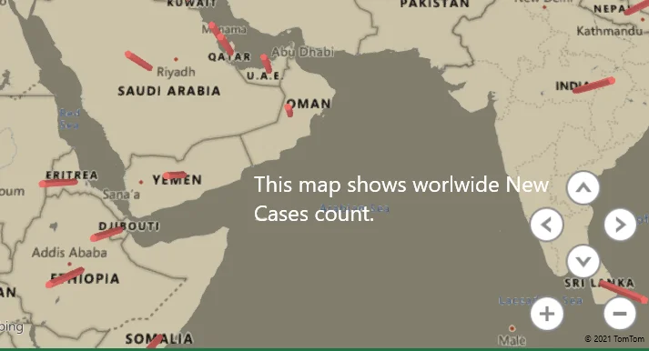
If you wish to edit the text in the box, double-click on the box to be able to edit the text again.
This tutorial was a detailed guide to creating beautiful 3D maps in Microsoft Excel. Stay tuned for more fun topics like this only at QuickExcel!
Reference: Dummies .
- All-Access Subscriptions
- Business Licensing
- Lightroom Classic
- Photoshop Elements
- Crystal Reports
- Interview Skills
- Resume Skills
- Excel for Lawyers
- Outlook for Lawyers
- QuickBooks for Lawyers
- Word for Lawyers
- Microsoft Office Suite
- Outlook on the Web
- Microsoft Project
- Microsoft Teams
- QuickBooks Online
- QuickBooks Pro
- Video Course Options
- SUBSCRIPTIONS
- Photoshop Elements 2024
- Photoshop Elements 2023
- Photoshop Elements 2022
- Photoshop Elements 2021
- Photoshop Elements 2020
- Photoshop Elements 2019
- Photoshop Elements 2018
- Photoshop Elements 15
- Google Classroom for Teachers
- Google Docs
- Google Drive
- Google Forms
- Google Sheets
- Google Slides
- Mac OS Keyboard Shortcuts
- Excel Formulas and Functions
- Excel Keyboard Shortcuts
- Excel Tables PivotTables and Charts
- Access for Microsoft 365
- Excel for Microsoft 365
- Microsoft Office 365
- Outlook for Microsoft 365
- PowerPoint for Microsoft 365
- Publisher for Microsoft 365
- Word for Microsoft 365
- Access 2021
- Microsoft Office 2021
- Outlook 2021
- PowerPoint 2021
- Publisher 2021
- Access 2019
- Microsoft Office 2019
- Outlook 2019
- PowerPoint 2019
- Publisher 2019
- Access 2016
- Microsoft Office 2016
- OneNote 2016
- Outlook 2016
- PowerPoint 2016
- Publisher 2016
- Microsoft Office 2013
- OneNote 2013
- Outlook 2013
- PowerPoint 2013
- Microsoft Office for iPad
- Word Keyboard Shortcuts
- QuickBooks Pro 2024
- QuickBooks Pro 2023
- QuickBooks Pro 2022
- QuickBooks Pro 2021
- QuickBooks Pro 2020
- QuickBooks Pro 2019
- QuickBooks Pro 2018
- QuickBooks Pro 2017
- QuickBooks Pro 2016
- QuickBooks Pro 2015
- QuickBooks Pro 2014
- Sage 50 Accounting
- Windows 11 and 10 Keyboard Shortcuts
- Chrome OS for Chromebooks
- Word and Excel (Mac) 2022
- Word and Excel (PC/Windows) 2021-2016 and 365
- QuickBooks Desktop (PC/Windows) 2024
- QuickBooks Desktop (PC/Windows) 2023
- QuickBooks Desktop (PC/Windows) 2022-2015
- Windows 11 and 10
- Our History
- Customer Service
- Testimonials
- Lost Password
- Register a Product
- Manage My Account
- Member Login
Try the Excel Course for Free!
Create a 3d map in excel – instructions, create a 3d map in excel: video lesson.
This video lesson, titled “ Creating a New 3D Maps Tour ,” shows you how to create a 3D Map in Excel. This video lesson is from our complete Excel tutorial , titled “ Mastering Excel Made Easy v.2019 and 365 .”
Create a 3D Map in Excel: Overview
Creating a new tour.
After enabling the 3D Maps add-in in Excel, you can then create a 3D Map in Excel. To create a 3D Map in Excel, click the “Insert” tab in the Ribbon. Then directly click the “3D Maps” button in the “Tours” button group. Alternatively, click the drop-down part of the button and select the “Open 3D Maps” command from the drop-down menu. The 3D Maps add-in then opens and creates a new tour for you if you haven’t yet created any tours in 3D Maps. This tour is named “Tour 1,” by default.
A separate “3D Maps” window then opens. It contains a Ribbon that with a “File” and “Home” tab at the top of the window. Below that, a list of scenes for the current tour appears in the “Tour Editor” pane at the left side of the window. The currently selected scene’s map data then appears in the middle pane to the right of that. Floating over this area is a “Field List” pane that contains the data from your data model. The “Layer Pane” appears at the right side of the window. This is where you edit the currently selected layer in your 3D Map. By default, this layer is named “Layer 1.”

Mapping Geographic Data
The first thing to do when creating a new tour is add the geographic data to map from the Field List to the desired layer in the Layer Pane. To do this, click and drag the geospatial data field to map from the Field List and then release it over the “Location” field within the “Data” section in the Layer Pane. Excel then attempts to identify and map the geospatial data in the layer.
The type of geospatial data that Excel thinks this field contains appears in a “geographical type” drop-down to the right of the field in the “Location” field. If Excel picks the wrong “geographical type” of data, you can click this drop-down to select the correct type of geographical data the field contains. Excel’s mapping confidence of the data field appears as a percentage above and to the right of the “Location” field. To delete a data field from the “Location” field list, click the “Delete Field” button at the data field’s right end within the “Location” field. Also note that you can add multiple geographical data fields to the “Location” field, if needed.
Selecting a Visualization Type
Next, you can select the visualization type for this layer by clicking the desired visualization type button at the top of the “Data” section in the Layer Pane. The type of data visualization you choose changes the fields and options available in the Layer Pane. Also, you can only choose the “Region” visualization type if you have regional geographical data available in the “Location” field. This is why you should add your geographical data to the “Location” field, first.
Mapping the Height, Size, or Value Data
Then click and drag the data field or data fields with the values to measure and map from the Field List pane into either the “Height,” “Size,” or “Value” field within the Layer Pane. The name of this field changes, depending on which visualization type you selected. Data fields added to this field within the Layer Pane are treated in much the same way as fields added to the “Values” section of the PivotTable Fields or PivotChart Fields task pane are.
By default, data fields added to the “Height,” “Size” or “Value” field within the Layer Pane are added together using the “SUM” function. You can click the drop-down button to the right of any data field in this list to select a different aggregate function to perform and map, if desired. To remove a data field from this list, simply click the “Delete Field” button at its right end in this field list.
Mapping Category Data
Next, if desired and if available for the data you are mapping in the “Height,” “Size” or “Value” field within the Layer Pane, you can then click and drag the field by which to categorize the mapped data from the Field List into the “Category” field in the Layer Pane. Note that the “Category” field in the Layer Pane is not available if you selected the “Heat Map” visualization type. The selected data field then becomes the legend for the mapped data. A legend for the selected field’s values also appears over the data map. You can only have one “Category” data field per layer. To remove a data field from the “Category” field in the Layer Pane, simply click the “Delete Field” button at its right end.
Mapping Time Data
Finally, to show the changes to the mapped data values over time, click and drag the field with the temporal (date/time) values from the Field List into the “Time” field in the Layer Pane. You can only have one “Time” field per layer. The values in this data field then provide the range of date/time values shown in the tour’s animation. To change the duration of time by which to map the related values within the “Height,” “Size” or “Value” field within the Layer Pane, click the drop-down to the right of the data field in the “Time” field in the Layer Pane. Then select the desired unit of time from the drop-down that appears.
To change whether the data mapped by the related values within the “Height,” “Size” or “Value” field within the Layer Pane show for an instant, display cumulatively, or are replaced by new values as the timeline progresses, click the “clock” icon drop-down button above and to the right of the “Time” field in the Layer Pane. Then select the desired display of the mapped data over time from the drop-down menu that appears. To remove a data field from the “Time” field in the Layer Pane, simply click the “Delete Field” button at its right end.
Final Steps
You can then change the view of the 3D Maps tour by clicking the “Tilt up,” “Tilt down,” “Rotate Left,” and “Rotate Right” buttons in the map. You can also click the “Zoom in” and “Zoom out” buttons to increase or decrease the map magnification. To preview the tour, click the “Play” button in the Time Line at the bottom of the map. If you don’t see the Time Line, you can click the “Time Line” button in the “Time” button group on the “Home” tab of the Ribbon in the 3D Maps window to toggle it on. Clicking this same button also turns it off.
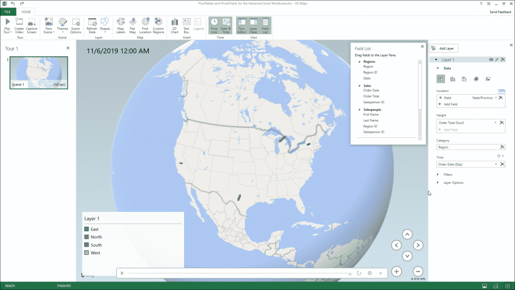
Create a 3D Map in Excel – Instructions: A picture of a user creating a new 3D Maps tour in Excel.
When you want to close the tour, click the “X” button in the upper-right corner of the 3D Maps window. Alternatively, click the “File” tab of the Ribbon in the 3D Maps window and then select the “Close” command from the drop-down menu that appears. You do not directly save changes to a 3D Map, as its changes are saved when you next save the changes to the workbook within which it is contained.
Create a 3D Map in Excel: Instructions
Instructions on how to create a new tour.
- To create a 3D Map in Excel , click the “Insert” tab in the Ribbon.
- Then either directly click the “3D Maps” button in the “Tours” button group or click the drop-down part of the button and select the “Open 3D Maps” command from the drop-down menu.
- The 3D Maps add-in then opens and creates a new tour for you if you haven’t yet created any tours in 3D Maps. This tour is named “Tour 1,” by default.
- Within the separate “3D Maps” window that opens, you will see a Ribbon that consists of a “File” and “Home” tab at the top of the window.
- Below that, a list of scenes associated with the current tour appears in the “Tour Editor” pane at the left side of the window.
- The currently selected scene’s map data then appears in the middle pane to the right of that.
- Floating over this area is a “Field List” pane that contains the data from your data model.
- At the right side of the window is the “Layer Pane,” which lets you edit the currently selected layer in your 3D Map. By default, this layer is named “Layer 1.”
Instructions on Mapping Geographic Data
- To add the geographic data to map from the Field List to the desired layer in the Layer Pane , click and drag the geospatial data field to map from the Field List and then release it over the “Location” field within the “Data” section in the Layer Pane.
- Excel then attempts to identify and map the geospatial data in the layer. The type of geospatial data that Excel thinks this field contains appears in a “geographical type” drop-down to the right of the field in the “Location” field.
- If Excel picks the wrong “geographical type” of data, you can click this drop-down to select the correct type of geographical data the field contains.
- Excel’s mapping confidence of the data field appears as a percentage above and to the right of the “Location” field.
- To delete a data field from the “Location” field list , click the “Delete Field” button at the data field’s right end within the “Location” field.
- Also note that you can add multiple geographical data fields to the “Location” field, if needed.
Instructions on Selecting the Visualization Type
- To select the visualization type for this layer , click the desired visualization type button at the top of the “Data” section in the Layer Pane.
- The type of data visualization you choose changes the fields and options available in the Layer Pane. Also, you can only choose the “Region” visualization type if you have regional geographical data in the “Location” field. This is why you should add your geographical data to the “Location” field, first.
- Then click and drag the data field or data fields with the values to measure and map from the Field List pane into either the “Height,” “Size” or “Value” field within the Layer Pane, depending on which visualization type you selected.
- Data fields added to this field within the Layer Pane are treated in much the same way as fields added to the “Values” section of the PivotTable Fields or PivotChart Fields task pane are. By default, data fields added to the “Height,” “Size” or “Value” field within the Layer Pane are added together using the “SUM” function.
- To select a different aggregate function to perform and map, if desired , click the drop-down button to the right of any data field in this list.
- To remove a data field from this list , click the “Delete Field” button at its right end in this field list.
Instructions on Mapping Category Data
- Next, if desired and if available for the data you are mapping in the “Height,” “Size” or “Value” field within the Layer Pane, you can then click and drag the field by which to categorize the mapped data from the Field List into the “Category” field in the Layer Pane. Note that the “Category” field in the Layer Pane is not available if you selected the “Heat Map” visualization type.
- The selected data field then becomes the legend for the mapped data. A legend for the selected field’s values also appears over the data map. You can only have one “Category” data field per layer.
- To remove a data field from the “Category” field in the Layer Pane , simply click the “Delete Field” button at its right end.
Instructions on Mapping Time Data
- Finally, to show the changes to the mapped data values over time , click and drag the field with the temporal (date/time) values from the Field List into the “Time” field in the Layer Pane. You can only have one “Time” field per layer. The values in this data field then provide the range of date/time values shown in the tour’s animation.
- To change the duration of time by which to map the related values within the “Height,” “Size” or “Value” field within the Layer Pane , click the drop-down to the right of the data field in the “Time” field in the Layer Pane and then select the desired unit of time from the drop-down that appears.
- To change whether the data mapped by the related values within the “Height,” “Size” or “Value” field within the Layer Pane show for an instant, display cumulatively, or are replaced by new values as the timeline progresses , click the “clock” icon drop-down button above and to the right of the “Time” field in the Layer Pane.
- Then select the desired display of the mapped data over time from the drop-down menu that appears.
- If you want to remove a data field from the “Time” field in the Layer Pane , click the “Delete Field” button at its right end.
Final Steps to Finish and Create a 3D Map in Excel
- To change the view of the 3D Maps tour , click the “Tilt up,” “Tilt down,” “Rotate Left,” and “Rotate Right” buttons in the map.
- To change the magnification of the 3D Maps tour , you can also click the “Zoom in” and “Zoom out” buttons to increase or decrease the map magnification.
- If you want to preview the tour , click the “Play” button in the Time Line at the bottom of the map.
- To show the Time Line, if needed , click the “Time Line” button in the “Time” button group on the “Home” tab of the Ribbon in the 3D Maps window to toggle it on. Clicking this same button also turns it off.
- To close the tour , either click the “X” button in the upper-right corner of the 3D Maps window or click the “File” tab of the Ribbon in the 3D Maps window and then select the “Close” command from the drop-down menu that appears.
- You do not directly save changes to a 3D Map, as its changes are saved when you next save the changes to the workbook within which it is contained.
About Joseph Brownell

- Skip to main content
- Skip to header right navigation
- Skip to site footer
My Online Training Hub
Learn Dashboards, Excel, Power BI, Power Query, Power Pivot
Excel 3D Maps
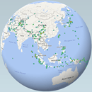
Excel 3D Maps in 2016, or Power Map as it’s known in Excel 2013, enable you to visualise data in, you guessed it, 3D!
No surprises there, however you may be surprised to discover insights you didn’t anticipate. Because unlike 2D maps or tables, with 3D maps we can quickly identify hot spots, anomalies, clusters etc. and connect them to the physical world.
For example, the image below shows earthquake data revealed over time:
3D Maps aren’t limited to geographic data, we can also plot data on a custom map like this football pitch displaying 2 players as they move around the pitch. The height of the columns represents their speed:
Version Restrictions
Power Map is available in Excel 2013 ProPlus for Office 365 users.
3D Maps are available in all versions of Excel 2016 or Office 365 for Windows users. In other words, it’s not available for Mac users.
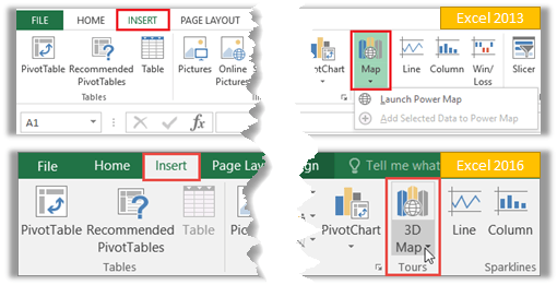
Note : Maps created in Excel 2016 cannot be opened in Excel 2013.
Tip: Power BI users have a similar custom map visualisation called Globe Map .
Download the Workbook
Enter your email address below to download the sample workbook.
Download the Excel Workbook . Note: This is a .xlsx file please ensure your browser doesn't change the file extension on download.
The file contains separate maps of the earthquake data for Excel 2013 and 2016. If you want the football data you can download it from the link at the bottom of this post. It's a large file, which is why I haven't included it for download here.
Creating Excel 3D Maps
Excel uses the Bing map engine to plot your data on the map and so it needs a connection to the internet for Excel to ‘talk’ to Bing.
It requires data in a tabular format . You can work with data in an Excel worksheet, or data already in the Data Model/Power Pivot.
If your data is in an Excel worksheet then select your data range > Insert > Power Map/3D Map. Excel will load the data to Power Pivot/Data model and open the 3D Map window.
If your data is already in Power Pivot/Data model you can go straight to Insert > Power Map/3D Map.
The 3D Map window (below) opens independently of the Excel window. It has the familiar ribbon and tabs found in all Office products.
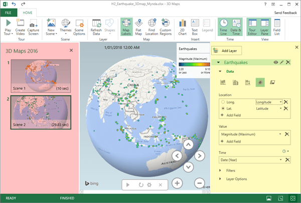
The left-hand Tours pane (highlighted in pink) is where you organise your scenes, which are the different views of your data.
The middle section is your map and the right-hand Layer pane (highlighted in yellow) is where you specify the fields and settings for your map data.
A close up of the Layer Pane is shown below:
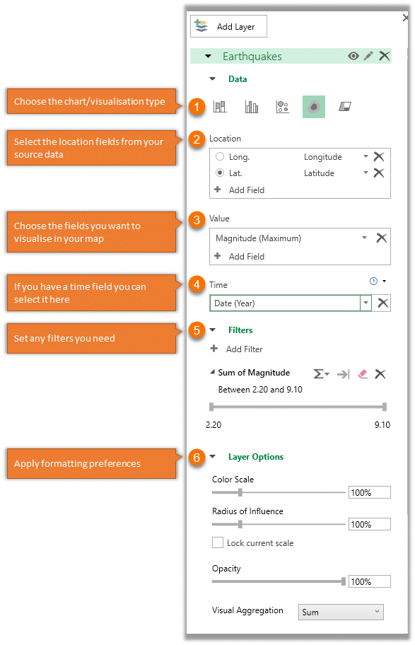
Layer Pane notes:
- The layer pane options vary slightly depending on the visualization type (1) you choose.
- The chart/visualisation types (1) available stacked column, clustered column, bubble, heatmap and custom regions (Custom Regions is available in Excel 2016/Office 365 only).
- Bing can work with various location attributes (2), as listed here:
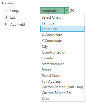
Note : the X and Y coordinates are for custom maps.
Excel 2013 Power Maps vs Excel 2016 3D Maps
For the most part the tools are the same. The most notable differences are that Excel 2013 doesn’t support custom maps, and you'll find some of the menus are a little different.
In Excel 2016 the right-hand Layer pane (shown earlier) contains all the setting options. Whereas the Excel 2013 layer pane is a little different, with tabs at the top to reveal different task panes.
The layer icon allows you to set the layer name, or add further layers:
The Field List icon is where you build your visualisation. It works much like the PivotTable field list:
And Layer Options and Scene Options are available under the gear icon:
Sharing Excel 3D Maps / Power Maps
We have three options for sharing 3D maps:
- Take a screenshot of the map. There’s a ‘Capture Screen’ icon on the ribbon to help you select the area you want:
- Create a tour video.
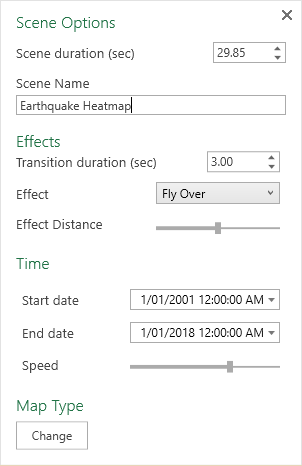
You can choose from various scene settings via the Scene Options icon in the Ribbon e.g. duration, and effects, even adding music if you want:
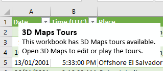
- Share the Excel file containing the 3D Map. When you insert a 3D map in your file, Excel adds a text box to alert the user that there is a 3D map in the file:
Updating 3D Maps
Clicking the Refresh icon in the ribbon (see image below) will refresh the connection to your source data:
And if your data is imported from an external source using Power Query it will also refresh that connection, bringing in any new data.
Learn Excel 3D Maps / Power Map
Learn tons of data visualisation techniques, including 3D Maps in detail, in my Excel Dashboard course .
Data sources
Earthquakes: https://en.wikipedia.org/wiki/List_of_21st-century_earthquakes
Football data: http://home.ifi.uio.no/paalh/dataset/alfheim/
Please Share
If you liked this please click the buttons below to share.

CIMA qualified Accountant with over 25 years experience in roles such as Global IT Financial Controller for investment banking firms Barclays Capital and NatWest Markets.
Mynda has been awarded Microsoft MVP status every year since 2014 for her expertise and contributions to educating people about Microsoft Excel.
Mynda teaches several courses here at MOTH including Excel Expert , Excel Dashboards , Power BI , Power Query and Power Pivot .
More Excel Charts Posts

Interactive Python Charts in Excel

Excel Progress Circle Charts

Pro Excel Chart Formatting
Excel Scroll and Sort Table
Picture Fill Excel Charts
Excel Speedometer Charts
Excel Project Management Burn Down and Burn Up Charts

Excel WeePeople Font Charts
Excel Dot Map Charts

Excel S-Curve Charts

Reader Interactions
September 3, 2019 at 9:10 pm
It is possible to clear/delete the Field list? I want to clear all history from the model, but can’t find how to clear th Field list.
Regards Nils
Mynda Treacy
September 3, 2019 at 9:51 pm
The field list reflects the data in the model, so you need to delete the data that you’ve loaded to the Power Pivot model.
Gary Kittleson
November 11, 2020 at 1:29 am
Thank you, but can you give me more details? How DO I delete that data? From the Spreadsheet itself? If so, how do I refresh the map to have the field list clear?
November 11, 2020 at 8:55 am
Hi Gary, If you want to delete everything then you’ll need to delete the source data in the worksheet itself, then refresh the Power Pivot model. If you just want to make some changes, then do so in the source data, then refresh the Power Pivot model.
June 5, 2019 at 5:25 pm
Hi – Is it possible to assign a macro to custom maps or some sort of action when clicking on a map feature? I would like to build a custom 3D Map, then interact with it to send back info into to a worksheet as I click on map features…long shot? If not any idea how I might achieve this type of user functionality in excel? Cheers
June 5, 2019 at 10:22 pm
I’m not sure if the object model extends to the 3D Map window. I suggest trying to record a macro in the 3D map window as that’ll tell you if it’s possible.
May 22, 2019 at 10:51 pm
I want 3D Map to show tenancies in our town starting and ending over a period of time so we can see the durations. I cannot see how to enter a duration or date-range into the Time field.
May 23, 2019 at 9:19 am
The time field is populated by a column/field in your source data that is formatted as a date/time that Excel recognises. You can’t enter dates and times as such.
If you’re still stuck, please upload a sample Excel file with your 3D map and data to our Excel Forum so we can see where you’re stuck and help you further.
March 19, 2019 at 2:56 am
I am trying to map a large amount of US zip codes. The zip codes that start with 0 show up in different countries. How do I get those zip codes to map to the united states?
March 19, 2019 at 6:34 am
Have you qualified the zip codes with a column for the country so there is no ambiguity in regards to what country the zip codes relate to?
March 14, 2019 at 12:51 am
Annotations can overlap and obscure each other. The only way I have been able to deal with this is using Edit Annotation -> PLACEMENT -> Left/Right, but if there are more than a few locations, annotations still overlap after switching between left and right. Is there any way to move the annotations so that they still point to the locations, but the annotation text boxes do not interfere? Thank you.
March 14, 2019 at 9:25 am
Hi Michael,
The only other option is to adjust the height so that annotations that are close together aren’t overlapping.
Peter Milner
February 6, 2019 at 1:24 am
Just wondering, in relation to the football pitch, how do you go about getting the x y co-ordinates to line up with the image? Or does the application automatically give you the x and y based on the image and then you enter it for each entry or player position?
February 6, 2019 at 10:03 am
It automatically detects them but you can override this in the settings. Give it a go and you’ll see what I mean.
June 5, 2018 at 2:42 am
This looks great. I’ve been playing around with the 3D maps. Any ideas on how I could get administrative borders layered onto a map? I’ve found a free .shp file that does it but do I put that as a separate layer or do it as a custom region? Thanks a mil as always. Anne
June 5, 2018 at 10:54 am
On the Ribbon choose ‘Custom Regions’. This will prompt you to ‘import a new set’. Then you choose the ‘Region’ visualisation in the Layer pane on the right.
Leave a Reply Cancel reply
Your email address will not be published. Required fields are marked *
Save my name, email, and website in this browser for the next time I comment.
Current ye@r *
Leave this field empty

IMAGES
VIDEO
COMMENTS
Create a 3D Maos tour to show a time-based relationship between geographic locations and their associated data in Excel 2016 for Windows.
With Excel 3D maps you can plot geographic and temporal data on a globe or custom map. You can show the data changing over time, build engaging, cinematic visual tours and importantly, any map you create can be shared with other people.
The video provides step-by-step instructions for creating the 3D map. First, the presenter opens Microsoft Excel and creates columns for time, x coordinates, y coordinates, and sensor data.
FREE Course! Click: https://www.teachucomp.com/free Learn about Creating a New 3D Maps Tour in Microsoft Excel at www.teachUcomp.com. A clip from Mastering E...
This tutorial is a detailed guide to creating stunning 3D maps in Microsoft Excel. With 3D maps, you can make your geographical data reports more attractive and informative, thanks to Excel’s smarter updates.
In this video, we look at how to use the 3D Map charts in Excel to create beautiful geographic insights. These charts are only available in Excel 2013 - known as Power Maps - and Excel...
To create a 3D Map in Excel, click the “Insert” tab in the Ribbon. Then either directly click the “3D Maps” button in the “Tours” button group or click the drop-down part of the button and select the “Open 3D Maps” command from the drop-down menu.
Excel 3D Maps, or Power Map as it’s known in Excel 2013, enables you to visualise your data on a world map or custom map.